
A logo is often seen as a visual signature. But for BEYERS, it is much more than that. Our logo is a reflection of how we look at pigeon racing, nutrition and success. It brings together heritage, expertise and philosophy in one clear visual identity.
Every element in the BEYERS logo has a meaning. Together, they tell the story of what matters most in the sport and of the role we want to play in helping fanciers move forward.
The rectangle in the logo stands for the four cornerstones of success in pigeon racing.
The first cornerstone is the fancier. Experience, observation and personal preference remain essential in the loft. Every fancier knows that no two lofts are the same, and no two approaches are exactly alike. The choices a fancier makes still form the foundation of every result.
The second cornerstone is the loft. A good loft is more than a place where pigeons stay. It is their safe and familiar home, the place they want to return to. In many systems, that feeling of home is closely linked to motivation, whether through a partner, youngsters or the structure the pigeons know and trust.
The third cornerstone is the system. Every fancier works within a chosen playing system, and that system has a direct impact on how pigeons are managed, trained and prepared. Success does not come from one element alone, but from how all the elements work together.
The fourth cornerstone is nutrition. Feeding is never just about filling the crop. It is about supporting the pigeon in the right way, at the right moment, within the right system. Nutrition is one of the key tools a fancier can use to guide condition, recovery and performance.
Together, these four elements form the frame around success in pigeon racing. That is why they are visualised as the rectangle: the structure that holds everything together.
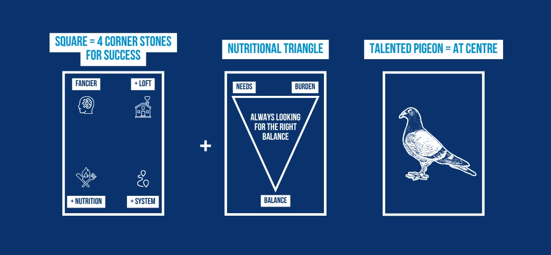
Inside that broader story, nutrition has its own symbol in the logo: the triangle.
This triangle represents what BEYERS sees as one of the most important principles in feeding pigeons well: the constant search for balance.
One point of the triangle stands for the needs of the pigeon. Another stands for the burden, or the level of effort and demand placed on the pigeon. The third point represents the balance you are always trying to find between those two.
That balance is never accidental. It is something you build carefully. A pigeon in a light phase does not need the same composition as a pigeon under heavy strain. Feeding too much towards one side or the other is never the goal. Just like a scale, nutrition only works properly when the balance is right.
That idea remains central to the BEYERS philosophy today. We do not see feeding as a fixed formula, but as a thoughtful process of adjusting composition to what the pigeon needs and what is asked from it.
At the heart of the logo is the pigeon itself.
That is no coincidence. In the end, everything starts with the pigeon. Talent, character and natural quality remain the core of the sport. A talented pigeon is the starting point. Without that foundation, no system, no loft and no feeding strategy can create a top pigeon out of nothing.
This is why the pigeon stands in the centre of the BEYERS logo. It reminds us that while nutrition, management and expertise all matter, the pigeon remains the most important element of all.
For BEYERS, that also defines the role of our nutrition. Feed must support the pigeon’s natural qualities, not replace them. The goal is always to help a talented pigeon express its full potential.
The name BEYERS itself goes back to the family name of the founder. A passionate and talented entrepreneur who created mixtures with excellent fanciers, who believed they were the very best for pigeons.
That personal conviction still forms an important part of the brand today. BEYERS may now be part of Group Depré, but it remains rooted in the values of a family business: passion, commitment, continuity and respect for the sport.
In that sense, the logo is also a link between past and present. It carries the name of a founder with a deep connection to pigeon racing, while still reflecting the philosophy that drives the brand today.
The reference to Belgium and 1908 is another essential part of the story.
Belgium is widely seen as the cradle of pigeon racing, and BEYERS is deeply connected to that heritage. Our mixtures are still made here, in a country with a long and rich tradition in the sport.
The year 1908 is a mark of experience. It reflects more than a century of involvement in pigeon racing, built together with generations of fanciers and experts. That heritage is not something we simply look back on. It is something we continue to build on, every day.
For BEYERS, experience and innovation are not opposites. The strength of the brand lies precisely in combining long-standing knowledge with a modern view on nutrition and performance.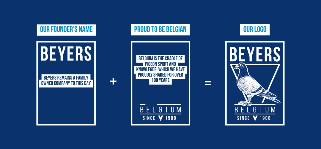
The BEYERS logo is more than a visual identity. It is a summary of who we are and how we see the sport.
The rectangle stands for the four cornerstones of success. The triangle represents the search for nutritional balance. The pigeon in the centre reminds us what everything is built around. And the name, the origin and the date connect that philosophy to a long family history in the heart of Belgian pigeon racing.
That is what the BEYERS logo stands for: heritage, vision and a deep belief that success starts with understanding the pigeon, respecting the system and finding the right balance at every stage.